The colour scheme on the double spread is pink, black, and white this ties in with the colour scheme on the front cover which is pink, white and black. In addition colour is used to emphasis key points that the magazine wants to get across to the reader whether it be the name of a person or the name of a person who has influenced the persons writing, below is an example of this:
Thursday, 21 October 2010
Analysis of the double spread of NME magazine
Analysis of the contents page of NME magazine
The contents page does use quite a lot of images scattered all over the contents page. The images have been constructed using a mixture of shots including long shots, close ups, two shots and the majority of shots are mid shots. This has been done to support what I initially found out about the front page, which was that the magazine wants to create a close and personal relationship with the audience they are doing this by using a variety of shots of bands/musicians that the audience will know and might not know. The images have also been constructed with direct and indirect mode of addresses, this has been done to help create and define a sense of individuality between the audience and the band/musician.
The information has been organised into different sections which are clearly outlined by lines boxing in the selected section, e.g. ‘ 32 “I can understand why pop has a bad reputation” Robyn one-women crusader against pop pap’ to make it easier for the audience to see clearly each section also making it easier for the audience to find a particular article if required. Moreover the information has been organised by making it black contrasting it to the white background, thus making it easier and quicker for the audience to access the information required. Lastly by the magazine organising it so that the images are placed in accordance to where the related articles making it so that all the reader has to do is glance at the image and easily find the information telling the reader where the related article is. In addition the colours used on the contents page are almost identical to those used on the front cover, red, white and black. The fonts are the same as the front cover as well bold, capital letters and eye drawing.
On the contents page there is only one promotional feature and this is ‘Want to get NME for the best price possible?’ This has been done by the magazine to give the impression that NME are giving the audience the best deal which in turn encourages the reader to buy NME on a more permanent basis. The magazine does not have any franchises on the contents page as they do not have any on the front page, the only form of advertisement is on the opposite page of the contents page, the inside cover, which is for a well known sports company ‘The Duffer of St. George’. Initially it is a surprise that the magazine logo is not placed on the contents page, however if you think about it, it does make sense for the logo not being on the contents page as from the front cover we get the impression that the magazine is bold and does the unexpected.
Analysis of the front cover of NME magazine
Just glancing briefly at the front cover of the magazine we the audience pick up from what the title NME stands for, New Musical Express, as this contrasts to the close up image of David Bowie and the anchorage text ‘Ultimate Hero’ we the audience/reader get the impression that the issues/articles included are going to be a blend of up to date music/musicians e.g. Lady Gaga and how they influence and inter-relate each other in modern music and its style.
The target audience is very broad in age limit as advertised on the front cover are up to date artists as well as up and coming artists but also artists from previous generations are advertised. This tells the audience that there is no age limits and that the magazine is for anyone who has a passion for music and wants to know, learn and explore about a wide range of music genres.
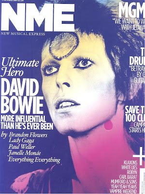
David Bowie is the person on the front this has been to let the reader know that the main feature/article included in the magazine is going to be related to David Bowie by maybe relating to how he influences & inspires the musicians around today. Overall the message that David Bowie is giving is one of reminiscing and remembrance, this is done by having David Bowie looking off into the distance. Also the image used is not one that has been taking recently it was taken at the ‘high’ point in his career or a special moment in his career that the editors want fans to remember about David Bowie.
The anchorage text ‘Ultimate Hero MORE INFLUENCIAL THAN HE’S EVER BEEN’ implies to the audience that the artist is in a sense more alive in the music industry than he has ever been, it also indicates to the audience that he is the heart of music now and what keeps attracting and drawing in new artists and people to music and by making more of an impression on modern artists now than he ever has done.
‘Ultimate’ this is the only buzz word on the front cover even though it is part of the anchorage text, the buzz word has the effect of making David Bowie seem like the top dog, the best in the music industry.
The colours used are black, white, red and yellow I personally find these colours attractive as they are bold and daring. This gives me the impression that this is the ethos of the magazine to be daring, bold and to show/ express individuality. I also find these colours attractive as they blend together making the whole page stand out more.
Wednesday, 20 October 2010
Analysis of the double spread of Kerrang magazine
The band My Chemical Roamnce who are featured on the front are a very well know rock band and even if you didnt know this then by just looking at them on the front cover suggests that the target audience will be people or fans of this type of music. The article is written in such a way that it is very person and suggests that the fans are very inporatant to the group, this has been done by the writer/author using words like ‘we’.
The double spread has been laid out in sucha way that it suggests that even though the band is one that they each have their own lives and each have something new to bring to the group, the music that it produces.
For the different pages of the article eventhough that they are all linked together each page is about a different member of the band, this is shown by the fact that there is only one image on each page. The member of the group that the particular page is about is shown through the image, the image is very dominating on the page however suggesting that the band are larger than life, and that in proportion to the text there is an even divide suggesting that they are a real band and not a wannabe rock band.
The article does not demand the reader to know any prior knowledge, the only thing it does require is for the reader to know that the genre of the band which is rock, however this is easily picked up from how the band is shown. Additionaly this is shown by the writer telling us about what they are up to now and referncing it to there past letting us know exactly whats happening.
‘The all important follow-up to 2006’s The Black Parade.’
Tuesday, 19 October 2010
Analysis of the contents page of Kerrang magazine
On the contents page the magazine does use a wide variety of images that are featured in the articles, they have been constructed so it is easier for the audience/reader just to look for any certain article that they desire through the image. The images do support my initial findings about the style and target audience of the magazine by uses images that are bold, of featured artists and of rock groups.
The information has been organised so that every piece of information is on an opposite background e.g. yellow writing on a black background making it easier for the reader/audience to find any particular article that interests them. Moreover the information is organised so that the title of each different page is in bold font style so it’s easier for the audience/reader to see and to know where what article is on what page for them to have easy accesses too.
The sections included are ‘Feedback, News, Win!, Live reviews, Features, Album Reviews, Gig Guide and K! Quiz’ these are a very broad/wide range in sections this tells me that magazine covers not only a very broad range of topics but that it has a good variety for its readers/fans to help keep them not only occupied but making the most and learning the most from this magazine.
The magazine logo ‘Kerrang!’ is placed dominantly on the contents page; it draws the readers view straight to it and then underneath it is what issues/articles are in the magazine.
Monday, 18 October 2010
Analysis of the front cover of Kerrang magazine
From glancing briefly at the front cover we get the sense that the magazine is going to include issues/articles about rock bands/groups, we get this impression because of the Skelton in the corner, the rock bands listed and Ozzy Osbourne (the prince of darkness).
On the front cover is Gerald Way a member of My Chemical Romance this has been done to indicate that the main feature/article is going to be on My Chemical Romance but more importantly as only Gerald Way is on the this tells us that the main focus of the magazine is going to be Gerald Way himself and how possibly he does what he does in the band. As the mode of address for the central image is directional this tells us that the type of relationship established with the reader will be a close and personal one; as his arms are wide open as if embracing an old friendship or even welcoming new people and forming a new found friendship. The overall message that is given by the artist is one of friendship and as Gerald Way’s arms are open it could give the audience the message of bring welcomed into a new type of music or new ideas / new perspective about the band.
The anchorage text which reads ‘WE FOUND A NEW WORLD! DANGER DAYS: THE INSIDE STORY!’ implies that even though the band is not a new found band and has been performing and well known for a while, they have turned over a new leaf and that they are going to go in a new direction with their music. ‘DANGER DAYS’ in the anchorage text indicates about the artist that they were in a dangerous place and it might also indicate about the direction that their career was going in and that now they are returning to a better band or are becoming a new band. The buzz word ‘EXCLUSIVE’ has the effect on the reader of making them think that they must buy the magazine to know as they will not fins the story anywhere else. Also it will give the reader a sense of knowing something about My Chemical Romance that not many people will know about them. ‘THE UK’S BIGGEST GIG GUIDE!’ is the slogan and it tells me and others that the magazine is a big publication and popular as well. This will help to attract readers and give the impression that this magazine is a must buy magazine as it will be the best and up to date not only concerning gigs but maybe in other areas for example the latest rock bands.
The title block has been designed to stand out, the slits/cuts/lines in the title tells us that the magazine is different and takes a different angle on articles. This has been done by making the title big, bold and in capital letters. The title Kerrang tells me that the readership is more than likely to be for people who have an interest in rock music as the word Kerrang is the noise made when playing an electrical guitar and electrical guitars are usually associated with rock bands. So this indicates me that the people most likely to read and most of the articles included in the magazine are going to relate to rock music. Even if I didn’t know what the word Kerrang meant I would still think that the readership of the magazine was related to rock, I would think this as the word Kerrang sounds loud, or a name of a rock group or just something generally related to rock. Furthermore the title of the magazine tells me that the image or how the magazine is represented is very loud, bold and individual as the word Kerrang is very individual, bold and has its own style. The style/appearance of the title Kerrang is very unique as it stands out no one will mistake it for another magazine and fans will instantly recognise it as Kerrang magazine. The title also indicates that the magazine is a music magazine so then the style will revolve around music and maybe the genre of rock.
The colours that have been used by the magazine, which are red, white, black and yellow, I do find attractive as I think that they not only stand out they make the central image impact’s on the reader more powerful than say if they had a pink or black colour scheme. The magazine uses strategies to attract the audience such as the ‘Hall of Fame Poster Special!’ and ‘4 covers to collect’ this has been done to keep the readers/fans that the magazine already has content but to also in an attempt to try and attract new readers.
Sunday, 10 October 2010
Questionnaire Results Analyse & The Planning
I also created questions relating to help me pin down the actual design of my magazine, colour scheme, free gifts and what catches the reader’s attention, so then my magazine will reach out to all potential customers. Based on my findings I have decided that I will be giving a free gift away most likely a cd or poster (related to the main article feature on the front cover) as these were the most popular responses given when asked if a free gift and what type of free gift would be well received by customers. The results I received for the colour scheme were inconclusive as there was no distinctive desired colour scheme; however the choice of colours has been narrowed down between blacks & whites and purples, reds and blues as these were the joint winners when this question was put to the participant.
The first thing I learnt from my questionnaire is that I will have a age range for my magazine from early teens to late teens. I have decided this because from the results I have collected I can see that all the different genres of music were all really close in popularity with R&B barely being the most popular type of music. So for my magazine to reach the teenage range which I have decided on I will need to cover a wide genre of music, as the participants voted the genres all in similar popularity.
Moreover as I was unsure whether I would be selling my magazine fortnightly or monthly I asked my participant’s how often they buy a magazine to try and help me decide which would be the better time to sell my magazine. I was also undecided on a appropriate price for my magazine, so i put this question also to my participant’s. From the positive results I have collected I have learnt and decided that the best way to make my magazine a success I will need to sell my monthly magazine at a rough price of £2.50-£3.50.I was unsure as to what feature of the front cover to make stand out to attract any passer’s by eye, so I put this question to the audience. I have learnt from the top four answers i received is that the image, bright colours, bold text and other things most attract the audience’s attention. So I have decided from these findings that I will make sure that the image that I place in the middle of the front cover is big and eye popping enough to catch the audience’s attention, as well as important text being big bright and bold to maximum the chance of catching potential customers eye.
Subscribe to:
Posts (Atom)