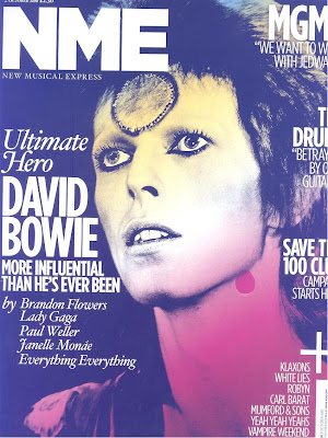
Just glancing briefly at the front cover of the magazine we the audience pick up from what the title NME stands for, New Musical Express, as this contrasts to the close up image of David Bowie and the anchorage text ‘Ultimate Hero’ we the audience/reader get the impression that the issues/articles included are going to be a blend of up to date music/musicians e.g. Lady Gaga and how they influence and inter-relate each other in modern music and its style.
The target audience is very broad in age limit as advertised on the front cover are up to date artists as well as up and coming artists but also artists from previous generations are advertised. This tells the audience that there is no age limits and that the magazine is for anyone who has a passion for music and wants to know, learn and explore about a wide range of music genres.
 From looking at the central image I can tell that the mode of address is indirect this has been done by the magazine to make the audience reminisce about when David Bowie was at the most popular stage in his career. Or so we think because if we compare the central image with the anchorage text ‘more influential than he’s ever been’ we get the impression of what David Bowie is like in real life, that he is a different person than from who we think. By making David Bowie look away from the front page and in effect the audience it gives the audience the sense that even though the times have changed David Bowie has not and has remained the much loved superstar that he always was. This shows the audience that the type of relationship David Bowie wants with his fans is not necessarily a personal one but a fan/ star relationship, it also indicates to the audience on David Bowie’s character that he likes his space and wants his fans to respect him.
 David Bowie is the person on the front this has been to let the reader know that the main feature/article included in the magazine is going to be related to David Bowie by maybe relating to how he influences & inspires the musicians around today. Overall the message that David Bowie is giving is one of reminiscing and remembrance, this is done by having David Bowie looking off into the distance. Also the image used is not one that has been taking recently it was taken at the ‘high’ point in his career or a special moment in his career that the editors want fans to remember about David Bowie.
The anchorage text ‘Ultimate Hero MORE INFLUENCIAL THAN HE’S EVER BEEN’ implies to the audience that the artist is in a sense more alive in the music industry than he has ever been, it also indicates to the audience that he is the heart of music now and what keeps attracting and drawing in new artists and people to music and by making more of an impression on modern artists now than he ever has done.
‘Ultimate’ this is the only buzz word on the front cover even though it is part of the anchorage text, the buzz word has the effect of making David Bowie seem like the top dog, the best in the music industry.
The colours used are black, white, red and yellow I personally find these colours attractive as they are bold and daring. This gives me the impression that this is the ethos of the magazine to be daring, bold and to show/ express individuality. I also find these colours attractive as they blend together making the whole page stand out more.
No comments:
Post a Comment